

Customer experiences have never been more important—or more complex.
Today’s marketing teams are expected to deliver personalized, high-performing content at scale, across an increasing number of channels. But when the design infrastructure isn’t built to flex, teams get stuck: templates get patched, layout decisions pile up and brand consistency can slip in the name of speed.
That’s where modular design comes in.
Modular design systems offer a smarter creative foundation that are built to scale, adapt and support strategic content delivery at speed. They reduce production lift, protect creative integrity and give brands a way to move fast without starting over. But they are not a silver bullet.
Modular Design Requires a Different Mindset
This is not just about building better templates. It’s about building a shared system that brings creative, product and development teams into alignment. Design objects and code components work in tandem. Designers pull from coded modules. Developers build for flexibility. Everyone works from the same source of truth.
Modular systems aren’t owned by any one team—they’re co-created and continuously evolved. That’s what makes them powerful. But it also means they only work when there’s clarity on content strategy, message intent and how each module supports the broader customer experience.
So, What Makes a Design System Modular?
A modular design system breaks content down into reusable, flexible components—each with a defined role, hierarchy and set of rules. Instead of managing dozens of ridged templates, teams build from a shared library of smart content blocks that can be assembled, personalized and versioned as needed.
This creates a consistent structure for how content shows up, no matter the message, channel or audience.
Done right, modular systems unlock:
- Faster production cycles
- Stronger brand consistency
- Easier personalization at scale
- Streamlined QA and dev workflows
- Clearer paths for testing and optimization
When content—not layout—is the foundation, your system becomes easier to maintain, faster to evolve, and more adaptable across teams and touchpoints.
A Strategic Layer: Atomic Design
Brad Frost published Atomic Design in 2016, and since then the book’s central idea has taken off as a major guiding principle of user experience design. If you’re not familiar with the concept, it applies the structure of nature’s elements at the atomic level to the structure of digital interfaces. Where atoms are the smallest building blocks that combine to create molecules and organisms, buttons, text and shapes can be put together to create login forms, FAQ and blocks of content.
This approach gives creative and development teams shared language and structure. It also future-proofs the system. When done right, new use cases can be supported by remixing existing components, rather than rebuilding from scratch.
Why Content Comes First
The best design systems aren’t just built to be flexible. They’re built around content intent.
That means starting with message hierarchy, aligning on what matters most to the audience, and building modules that support the real shape of the message. When the system reflects how your brand actually communicates—across lifecycle stages, personas and touchpoints—teams can move faster without losing focus.
This is especially critical for brands managing multiple regions, audiences or programs. You can’t build a new layout every time a message changes. You need a content system that is built to evolve with the message, the moment and the market.
Built for Modern CX Needs
Good modular systems aren’t just built for aesthetics; they’re designed for how people actually consume content today.
Mobile-first architecture
Most content today is consumed on phones, not desktops. That changes everything about how we design. Mobile-first modular systems aren’t just smaller—they’re smarter. They force clarity in hierarchy, simplify structure, and put usability front and center. If your components aren’t thumb-friendly, fast-loading, and scannable, you’re not meeting people where they are.
Dark mode behavior
Dark mode isn’t just a visual preference, it’s a usability feature. Strong modular systems include system-level styling that adapts across environments, with tested color variables and design rules built into the components. That means better consistency, legibility, and brand integrity in both light and dark settings.
Accessibility standards
The most scalable systems are the ones that include everyone. That means designing with accessibility from the start: contrast ratios, semantic structure, screen-reader behavior, tap targets. Not only is this the right thing to do, but it also future-proofs your content. Because if your system can’t adapt to different abilities, it won’t adapt to different channels, either.
Platform-aligned personalization logic
Personalization only works when it aligns with how content is delivered. If your components aren’t designed to adapt to context—like user behavior, lifecycle stage, or location—they’ll bottleneck your strategy. Modular systems need to align with how your marketing platforms actually work. That means building flexible logic into your content blocks from the start, so your messaging isn’t just repeatable—it’s relevant.
Proof It Works
We’ve implemented modular systems for some of the most complex, high-volume programs in market—from tax season to multi-location retail to global dealer networks.
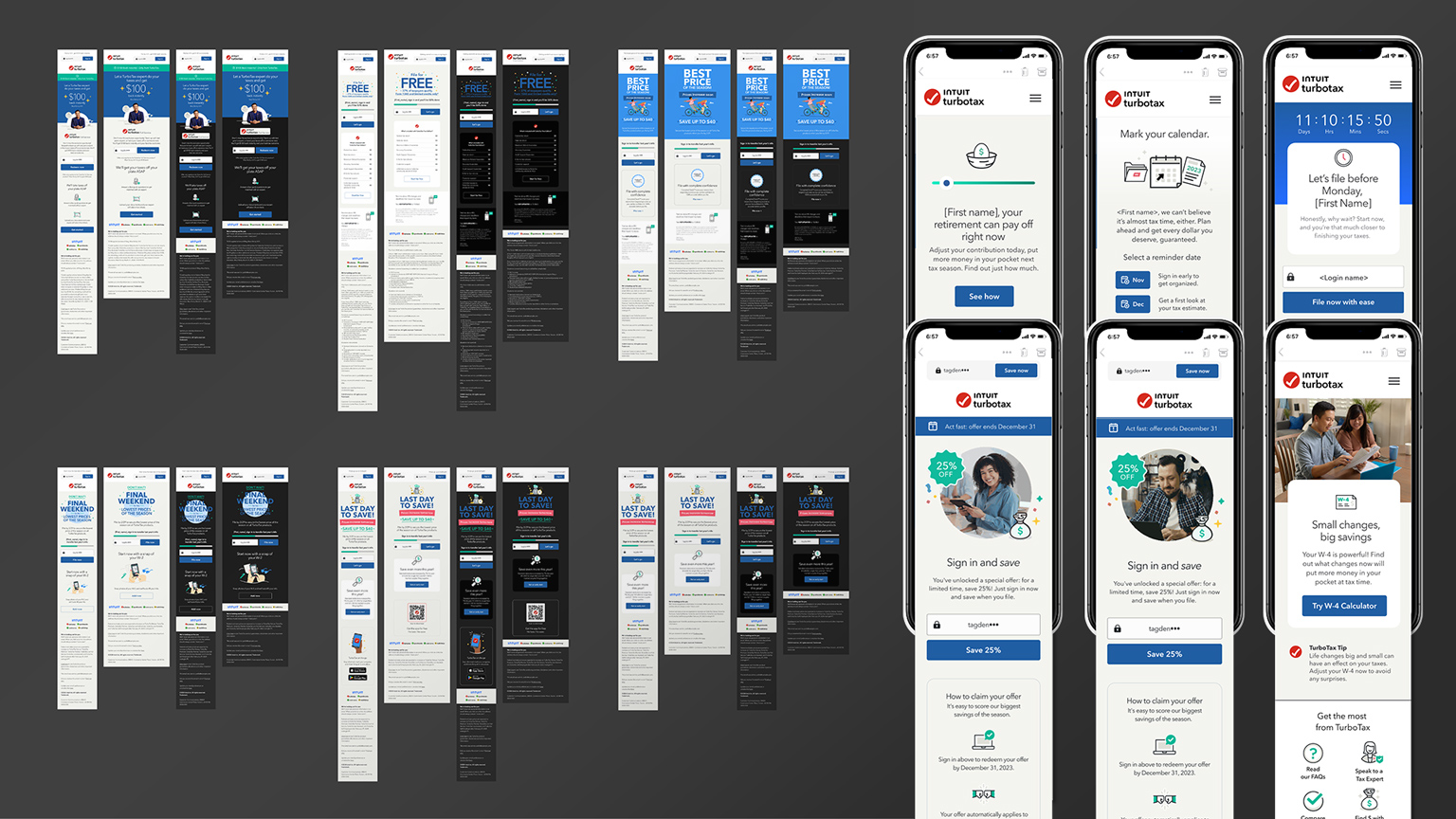
A modular system helped Intuit TurboTax scale weekly, personalized campaigns based on user behavior and tax data—leading to a 130% lift in email engagement. The work also won multiple OMMA Awards.
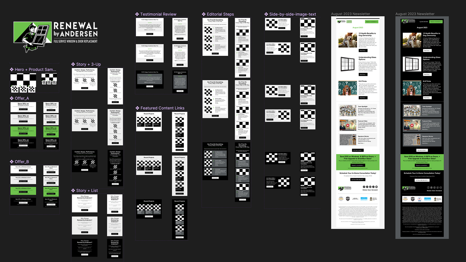
We streamlined 130+ automated emails for Renewal by Andersen across regional markets, enabling localized personalization without sacrificing brand standards.
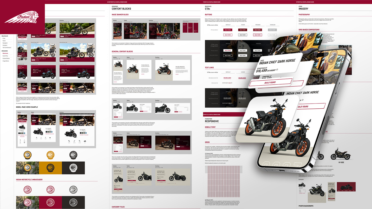
We designed a modular design system that elevated Indian Motorcycle’s digital brand expression to reflect the premium nature of their band and establish new definitions of consistency in the way both brand elements and site components are used.
Remember: Modular Design ≠ One-Size-Fits-All
The fear with any system is that it will create sameness. But modular systems don’t limit creativity—they define where it lives.
By giving teams a clear system to work within, you actually create more space to experiment with hierarchy, storytelling and visual treatments—because you’re not spending time on layout decisions that have already been solved. The system creates clarity, not constraint.
If you’re just getting started, here’s where to focus:
- Start with content strategy. What messages matter most? What stories do you tell often?
- Map your journeys. Understand where consistency drives value, and where flexibility matters most.
- Think in systems, not assets. A well-designed block library beats a folder of static templates.
- Design for the edges. Don’t just plan for the hero image—build for versioning, scaling and exceptions.
Final Thought
Modular design isn’t just about better emails or landing pages. It’s about building a system that empowers teams, elevates brand expression and makes personalization sustainable.
If you’re still managing content like it’s 2015, you’re spending too much time and getting too little return It’s time to think modular.
Want to workshop your system strategy? Let’s talk.
Ready to build better emails? Check out our guide: A Bold Approach to Better Emails