

Creating a design system is a complex and often daunting task. Not only does it mean working with your brand/marketing teams and company style guide; it also means creating a component library, collaborating with developers to align on how those components should function and where they should be used, and writing documentation so that everyone understands how to use the components. The larger and more complex the company’s product structure, the larger and (in some cases) more complex the design system. With all of that effort and time being spent, it’s critical to remember that consistency in your design system will influence consistency in your customer experience.
Sustainability—making your system scalable and adaptable without compromising consistency—is also an important consideration when it comes to design systems. One of the best ways to make your system sustainable is to standardize it. This is probably more relevant to designers in an agency or consultancy setting, but can be equally beneficial to in-house designers.
The Universal Language of Atomic Design
Brad Frost published Atomic Design in 2016, and since then the book’s central idea has taken off as a major guiding principle of user experience design. If you’re not familiar with the concept, it applies the structure of nature’s elements at the atomic level to the structure of digital interfaces. Where atoms are the smallest building blocks that combine to create molecules and organisms, buttons, text, and shapes can be put together to create login forms, FAQs, and blocks of content.
When I sit down to create a design system, I start with this concept as my organizational map. Every design system needs typography, buttons, colors, icons, and images, and these elements are combined to make larger and more complex ones. This is where you can work out your button states, and if you’re using a system like Figma, set your text and color styles. Since the atoms also act as a baseline for how your UI will look and function, I can then set about creating molecules, organisms, templates, and pages.
Several past clients have come to me with component libraries in which elements are grouped by page or use case. Setting components up this way may make sense to your design team in the moment, but new folks joining your team will first have to learn the context of what each group means or what it’s used for before becoming fully proficient. By contrast, standardizing with atomic design provides a universal framework that’s easy to grasp (even to someone not familiar with the specific methodology).
It’s also important to take into consideration what design tool you’re using. For example, Sketch allows you to name the various levels of components in such a way that the structure and hierarchy within the different atomic levels is apparent. Figma’s assets panel functions a bit differently, so you’ll have to use different page names when you set up your library.
Taking some extra time at the beginning to plan small details like this will save time later when you’ve grown your team or handed the project off to someone else.
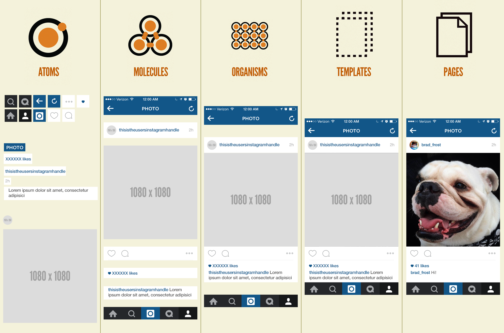
Atomic design applied to a version of Instagram’s mobile app, courtesy of Ben Frost.
Give Users a Starting Point
If you’re building a design system for a large company, there’s a good chance that your UX or product team won’t be the only ones using it in crafting digital experiences. The last couple of companies I’ve worked with have had marketing teams separate from UX or product design, and they’re often not as familiar with modern design tools like Figma. To make it easier to jump in, consider giving your users a starting point.
In my design systems I like to create a specific “Canvas” component, one each for mobile and desktop. They contain an embedded header, footer, and a content well, and are set up so that, as the designer extends the length of the canvas to accommodate content, the header and footer maintain their positioning at the top and bottom. Using auto-layout in Figma means that all the designers have to do is drag in the other components I’ve created and change the images and copy. No more spending time nudging elements.
Each canvas lives on its own page in the component library, with “**START BUILDING HERE > Canvas” as the title. This means when someone opens the library in a working design file, “Step One” will be at the top of the list.
Don’t Forget Documentation
Each page within my component library contains the component name, its atomic level, information on dimensions and sizing, and instructions on use cases. Since I primarily use Figma, I also use it as a space to instruct others how to change variants if applicable.
We designers are passionate about providing a good user experience for our users, so let’s remember that “users” can include other designers as well! And since our field is not a monolith, we shouldn’t assume everyone has the same level of experience or comfort with any design tool or process.
If you’re working with an existing system and certain components end up being archived or sunsetted, make sure to briefly include reasons they’re being pulled out of rotation. This will prove to be a boon when, years later, someone wants to reinstate an old component or design pattern and you can see exactly why you removed it in the first place. Numerous times on past projects and teams I would present some designs or sketches or wireframes and one of the long-tenured members of the team would say, “Didn’t we get rid of something like that a few years ago?” Because the decisions and reasons were never documented, we sometimes found ourselves taking up additional time and effort trying to figure out which way to go.
Building for the Future
As philosopher Alan Watts pointed out in the 1960s, an entity such as an organization or university is like a whirlpool; a whirlpool isn’t a “thing,” but a system, a pattern through which water moves. A company is also not a “thing;” it’s a system. Over time the buildings change, the people change, the products change, the brand changes, etc. It’s important to keep that potential for change in mind when building your design system. As anyone who has worked in the tech industry can attest, one doesn’t necessarily know where they might be a month or five years in the future, or if they’ll be there to personally walk future designers through its use. Thus, a design system needs to be built with a future in mind that extends beyond yourself and your team’s immediate needs.
By standardizing your design system’s organization and layout, you’ll be setting your designers and clients up for success. You’ll enable them to work more quickly and efficiently, as well as setting them up for consistency no matter what the future holds.